Typography is always weird for me to tackle in the design space. Mainly when I’m attempting to give it a reason to be used. So funnily enough I look at calligraphy to see how I can show the emotion I want to display so I can better display it in my typography. A good example of this is some of my work on the menu project. While I didn’t finish much of the main part I had the idea of keeping the typeface readable and soft, to mimic a place of comfort and ease. I didn’t want any sharpness or pointy edges, jaggedness in the typeface because in other types of art sharper lines normally display trickery or discomfort in some cases. But soon I’ll get the hang of it.
GhostyTheBlogger
Because spite is that strong.
recent posts
about
-
1.https://youtu.be/1572-EzXh5Y?si=KnTO0t55gpNfugRA
- How to set up your doc presets, depending on the project.
- Link pictures instead of embedding them to save file space.
2. https://youtu.be/IN3EKAKFXUE?si=57FgmVfMkkt9Qc3S
3. Paragraph shading so you don’t have to change the text against the background with a separate frame
3.https://youtu.be/IqxrzUAi2nU?si=xI9BeOM8CV9Xx_RY
4. Making text fit better into frames with ctrl b for editing
5. Using generative expand to fill in gaps in images instead of warping the image itself.
-
Something I wanted to learn is how to meld the text better with pictures in Indesign. There is probably a video about it but I want to try and find it myself, it’ll at least help me navigate, I want to incorporate more of my personality into the Indesign process.
-
Today’s creative exercise is one about colors, taking something you’ve previously made in design and turning it into something else without changing the content, just change the color. It makes you think about what emotions the colors convey and express with different pieces, adding more red or blue to a pallet to change the meaning of the piece or just changing the whole vibe of the picture itself.
-
I’ve been writing for a while and I wanted to show that in this 11×17 two page spread. As a kid I was never good at drawing but I’ve always loved the process of writing, especially writing songs. It’s been the most fun to dissect other artist and even write my own verses and that’s the reason I’m in this class. To expand my knowledge on things outside of music like thumbnails and writing more informative pieces. It’s always been my favorite part of the music making process.
-
Today, I was speaking to a friend about international branding. Different brands or clever puns are often taken for granted but language barriers are a pretty hill to climb for marketing. An example is YouTube. Here in the states YouTube doesn’t have auto-translate for other languages, because of the vast pool of languages spoken here it’s assumed that the media is chosen due to the language you speak. But in Spain and specifically on reddit if you were looking for something in English or Russian it would auto-translate everything, and that means the full context of words, puns jokes or other nuisance are lost due to translation.
-
Link 1: https://youtu.be/NLz6PXwYnuE?si=cWkEoe_SlCvzcPYu
-I learned how to put animated gifs in projects.
-I learned how to make a table of context
Link 2: https://youtu.be/fUzO7crWpgk?si=egfM9FMr8OMN90Id
-I learned how to import files directly into indesign
Link 3: https://youtu.be/4_Hi3tiCa7s?si=S1B8DMrTWln5KStJ
I learned a lot of shortcuts which are very important in the ease of use.
-
This creative exercise is one I got from an old teacher called ‘trust fall’. Like the name implies you are to close your eyes and let your hand fall on an object. Normally you’d have to describe it to someone behind you and they’d choose wether or not to let you keep passing it, changing what the item is until it gets to the end of the line but in this case I took an item and described it in it’s opposites. I feel like I did make a mistake in using opposites to describe an object, especially when I didn’t have a ton if objects to work with, the exercise did expand my thoughts process when it comes to how to build objects like a toy car, having to break down it’s parts and describe what it isn’t was a challenge but one that make me realize how many things count toward an opposite of something.
-
For this assignment, I wanted to show the comfort of my Mexican, Haitian and Italian flavors through typography. The concept is the comfort that people feel absorbing cultures so the typeface needs to feel inviting, expressive and easy to read.
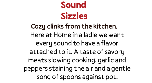
Typographic Direction 1: Home in a ladle
Headline Sample- Sound Sizzles -Pally Bold
Subhead Sample- Cozy clinks from the kitchen. -Pally, Medium
Body Sample- Here at Home in a ladle we want every sound to have a flavor attached to it. A taste of savory meats slowing cooking, garlic and peppers staining the air and a gentle song of spoons against pot. –
Reason- Simple text that expresses the idea of comfort, round shapes are not jagged showing a soft side, and easily readable.
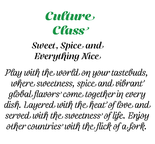
Typography Direction 2: Tri-Spice
Headline Sample: Culture Class – Telma(Black)
Subhead Sample: Sweet, Spice and Everything Nice -Telma(Regular)
Body Sample: Play with the world on your tastebuds, where sweetness, spice and vibrant global flavors come together in every dish. Layered with the heat of love and served with the sweetness of life. Enjoy other countries with the flick of a fork.
Reason: Still gives off the same comfort but in a more regal, refined style, keeping the round shapes and ease of reading just in a classier style.
-
Positioning
Primary Audience:
Young professionals and old souls from early 20s to late 80 that enjoy cozy foods, and comforting plates. These are the type that enjoy feeling at home even if it’s miles away.
Secondary Audience:
Tourist who want to try something new, families that want to experience the feeling of home away from home. Where comfort and culture meet.
Internal positioning paragraph:
Our brand lives at the intersection of Haitian spice, Italian comfort, and Mexican fire—blending rich culinary traditions into something bold, layered, and beautifully unfamiliar. Each dish delivers a sensory experience that feels savory and sweet at once, where slow-simmered depth meets vibrant heat and soulful warmth. We exist for young professionals and old souls alike—from early 20s to late 80s—who crave cozy, comforting plates that feel like home, even when they’re miles away. At the same time, we welcome curious tourists and families seeking something new yet familiar: a place where comfort and culture meet, and every bite tells a story of heritage, connection, and belonging.
Core Values:
Cultural Fusion with Respect
We honor Haitian, Italian, and Mexican culinary traditions while blending them boldly and thoughtfully into something new.Comfort Above All
Every plate should feel like home—warm, satisfying, and deeply nourishing to both body and spirit.Layered Flavor, Layered Experience
Just like our dishes, we believe experiences should be rich, balanced, and memorable—savory and sweet, bold yet familiar.Hospitality Without Borders
We welcome young professionals, old souls, families, and travelers alike—creating a space where everyone belongs.Authenticity in Every Detail
From ingredients to atmosphere, we stay true to the soul of our roots while embracing innovation.Community & Connection
Food is a bridge. We cultivate spaces where stories are shared, cultures meet, and relationships grow.Bold Creativity
We are fearless in flavor and expression—pushing boundaries while respecting tradition.Consistency & Quality
Comfort comes from reliability. Every visit should feel just as satisfying as the first.Home Away From Home
No matter where our guests come from, they leave feeling grounded, cared for, and connected.Mission Statement:
Our mission is to craft food that feels like a warm embrace—where vibrant Haitian spice, Italian comfort, and Mexican fire come together in harmony. We exist to create a home away from home, where every bite tells a story, every table builds connection, and every guest belongs.
