For this assignment, I wanted to show the comfort of my Mexican, Haitian and Italian flavors through typography. The concept is the comfort that people feel absorbing cultures so the typeface needs to feel inviting, expressive and easy to read.
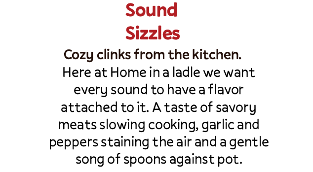
Typographic Direction 1: Home in a ladle
Headline Sample- Sound Sizzles -Pally Bold
Subhead Sample- Cozy clinks from the kitchen. -Pally, Medium
Body Sample- Here at Home in a ladle we want every sound to have a flavor attached to it. A taste of savory meats slowing cooking, garlic and peppers staining the air and a gentle song of spoons against pot. –
Reason- Simple text that expresses the idea of comfort, round shapes are not jagged showing a soft side, and easily readable.
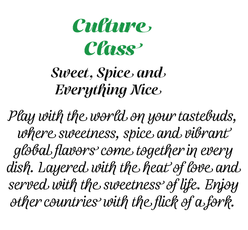
Typography Direction 2: Tri-Spice
Headline Sample: Culture Class – Telma(Black)
Subhead Sample: Sweet, Spice and Everything Nice -Telma(Regular)
Body Sample: Play with the world on your tastebuds, where sweetness, spice and vibrant global flavors come together in every dish. Layered with the heat of love and served with the sweetness of life. Enjoy other countries with the flick of a fork.
Reason: Still gives off the same comfort but in a more regal, refined style, keeping the round shapes and ease of reading just in a classier style.

Leave a comment