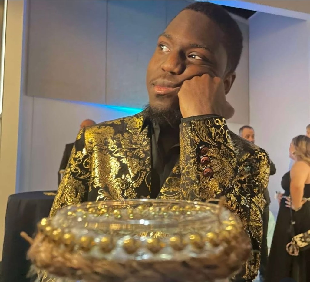
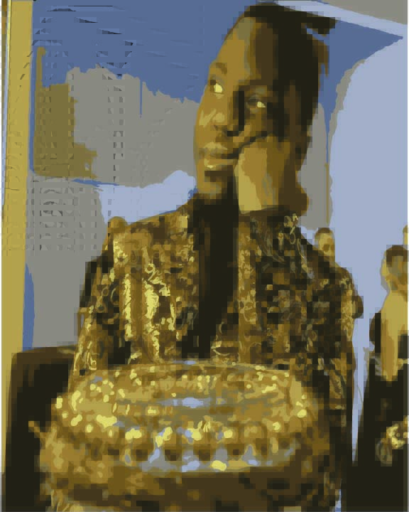
• So this was pretty hard for me in particular because I am a little darker, so the shading was a chore, especially with the gradients. But looking at it now I do love what it looks like. What I started with was a pretty easy blend, most of the time was me messing with the colors, limiting the colors I used made the image really pop, and I just personally like the black and gold combination. The outcome is more or less the same, it looks straight out of a movie and I personally am really proud of how it turned out. I assumed it would look at lot worse due to my naturally darker tone so the lighting would be horrid but I am glad I was wrong.

  • Pride defined in definition is a feeling of deep pleasure or satisfaction derived from one’s own achievements, however the sin is the belief of thinking those achievements as beyond the realm of satisfaction. The sin of pride is that of self-glorification, arrogance, thinking oneself as perfect. I thought about what would be the best representation of this self-glorification and ideal of perfection and the first thing I thought of was Lord Shen the peacock from the movie Kung-fu Panda. A pretty wild thought process but the idea is that in the movie Shen sees himself as perfection, so much so that he’d rather die then admit that he isn’t so I thought why not make the most prideful of birds for this project. The idea is that the peacock doesn’t need to show it’s feathers because it already sees itself as perfect, even if people attempt to sway it from this idea, it doesn’t hear listen, as if it’s worlds apart, a god in the form of a bird.

  • Something I’ve been finding myself get more interested in is funnily enough sound design. Our 5 senses allow us to absorb information, sight and sound being the main way media is absorbed. The best example is video games, mainly the impact of those games. How a game ‘feels’. Fighting games come to mind as the sound and how a hit or impact looks plays a big part in the game feel. You can have the impact of a punch but what that punch sounds like will make or break that game. One of the biggest ones that come to mind is a port of Mortal Kombat 1 for the Nintendo switch. The game was so horribly optimized for the console that sound clipping and visual glitches causing the game to stutter with the heavier hits were used. I just think it’s a very interesting thought process on how we determine good sound design.

  • Words have a very powerful impact on things. So for this creative assignment I found an exercise called “Say it without saying it.” The basic plan of this is to make an ‘honest’ statement without directly naming an emotion. Which isn’t the easiest with how much importance emotion takes in the English language especially when claiming a statement. The statement I did choose was ‘I tried to remember, even if I don’t, it’d be foolish to tell you.’ The statement was pretty hard to convey emotion without directly saying it, I figured the statement could be a memory. I was attempting to convey a somber emotion, the empty feeling of knowing something but not being able to tell anyone. The perils of being alone with the thoughts of friends.

  • The assignment was to create an illustrative poster, playing around with the type face and shapes in general in illustrator. While the hard part for me was to be able to find an open event I remembered about an album tour the artist Asap Rocky was doing for his new project ‘Don’t Be Dumb’ a pretty simple title but with the way the album is strung like a warning for people to not judge a book by it’s cover, I hope I did it justice to show the very, matter of fact nature of the album with this piece.

  • The other day we learned about something called dummies. Kinda like crash dummies, it’s a way to test how something is built, which in the case of architecture is really helpful. It also puts into perspective of how many things are built from small pieces and moving parts. We made paper airplanes and made the seprate blueprint of the airplane into illustrator. It was pretty interesting to say the least.

  • Due to the lack of creativity I’ve been face the creative exercise I chose to do was umbrella. It’s were you write a bunch of random words and try to conect them. Trying to find a word link between the two words like, star wars and frying pan. It’s supposed to make you think about the possible relationship between the two items, as random as they are you can’t just say things like ‘Can be cold’ because space is cold and so is a frying pan. It has to be something related to the two in a way where you could use the word in both contexts. Which is hard, it makes it so you have to be very careful with what you know and how you relate to the two objects. It made me realize that the way I relate some items are with people and less the function of the items themselves.

  • The idea for this tattoo came from how I personally see tattoos. They are a mark on your body that shows your personality, ideals, principles etc. The tattoo shows a statement or image about how you show yourself and how you want to be seen, but throughout the years of having that tat, it fades. Even if small, the picture slowly fades away, deep into the skin where only you know what lies beneath. Further years will soon have that picture turn into a memory, a thought, a mark of what was. While some see tattoos as a stain on the skin, I believe it is a mark of the outward appearance into someone’s soul. “The Body Rots; Yet The Soul Burns” it’s a smile picture of a soul marked with the alchemist symbol for sulfur. When a body fully rots the smell of sulfur tends to be the strongest, yet what that person is known for, the ‘soul’ will stay in the ideas and hearts of those who live on. It will burn with a flame hotter then the smell of sulfur and overpower even the stench of death itself.

  • I’m currently still attempting to do the bezier game and I am stuck on the car. However I am also too stubborn to look up how to do the car. This has made me think about other ways to approach this design game, as strict as it is it does let you try all different angles. Unfortunately, the angles I’m picking are indeed the wrong ones.

  • Today’s creative excersize was a simple one. It was pumpkin carving, but I had to do it from the inside out. It’s supposed to have you think about how you approach obstacles and deal with things that might be in the way. The worst part was trying to carve in the opposite direction because when facing outward everything else is inward. It’s really hard to think backwards. I’ve done this with words but with an image it’s a lot harder then I expected